#TRENDING: Will going 'green' bring hope to 2017?

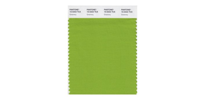
The doyens of colour, the Pantone Colour Institute, have announced, as they do every year, that the colour green, more specifically, “Greenery”, will be the “Colour of the Year” in 2017. Their decision was apparently motivated by the need to bring “hope” to citizens the world over.
Pantone Colour Institute executive director, Leatrice Eiseman, told the New York Times, that the colour symbolised “hopefulness”: “We know what kind of world we are living in: one that is very stressful and very tense. This is the color of hopefulness, and of our connection to nature. It speaks to what we call the ‘re’ words: regenerate, refresh, revitalize, renew. Every spring we enter a new cycle and new shoots come from the ground. It is something life affirming to look forward to.”
Greenery is more of a yellow-green, specifically Pantone 15-0343. The psychology of colour is a science and Pantone has been officially tracking colour trends for almost two decades. The Greenery trend started popping up on runways earlier this year and in home furnishings. Basically they choose the colour of the year after observing colour trends around the world and across industries and then interpret the meaning of this trend.
“The colors have become a sort of windsock for determining which way the national mood is blowing,” the New York Times aptly describes the process.
Time magazine also suggests that the Greenery trend points to a focus on the environment and will provide “hope” in these fraught times.
Hopeful
Local trend forecaster and designer, Dave Nemeth, the founder of Trend-Forward business consultancy, accurately predicted the greening trend several months ago in his FutureForge design trend report. He called it “Edenesque”, the process of combining outside spaces with internal spaces with the key accent colour being green against a neutral backdrop of grey and natural timbers. He accurately predicted that green would be a key colour in 2017 and used in fabrics, furniture, as well as décor and design object D’art.
“Whilst Pantone have their own definition as well as motivation for choosing this colour, I do think it is globally representative of nature and the outdoors,” Nemeth told Bizcommunity.com.
“On the positive side, green is often referred to as the colour of life, renewal, nature, energy; and is associated with meanings of growth, harmony, freshness, safety, fertility, and environment. The world is currently experiencing many disruptive issues and people are consumed by technology and this colour provides an uplifting element to the noise and chaos that surrounds our daily lives.”
Nemeth also believes that green is a hopeful colour. “Green, and specifically the Greenery colour which is bright and has a good mix of yellow in it, is certainly an uplifting and cheerful colour. It is in fact quite a contrast to the past two years where last year two colours were introduced for the first time by Pantone - the calming hues of Rose Quartz and Serenity; and the serious and spicy Marsala in 2015.”
Nemeth does caution that the Pantone colour of the year has not always been as relevant to the South African market as to the European or American markets, due to a host of factors, including our climate, as well as our bright natural light that we experience all year round.
“The 2017 colour Greenery, however, is certainly relevant to our country and I think we will see this colour translated heavily in fashion, furniture, interior design and textiles. As an accent colour it can be placed against almost any neutral backdrop and is beautifully combined with grey, which is the current neutral of choice,” he concludes.


