Top stories


HR & ManagementRecalibrating reward - part 2: How performance should really be measured
Camille Rabier 5 hours


ICTSamsung celebrates remarkable Level 1 B-BBEE Accomplishment for 8th consecutive year
Samsung 29 Apr 2026
More news


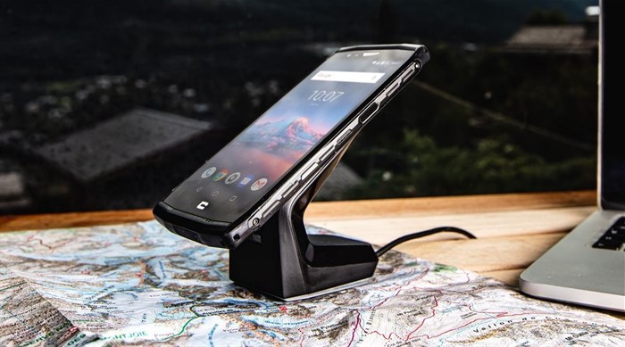
Launched in 2009 by Cyril Vidal, a French entrepreneur, Crosscall’s ‘raison d'être’ was firmly centred around suitability. While some critics were sceptical about the 100% French-owned company going up against other mobile giants, the unique positioning of the brand seemed to appeal to a number of outdoor enthusiasts and professionals working in tough and demanding environments.
Vidal’s product, built firmly around his love of watersports and his professional career, with suitability at the heart of the brand’s philosophy, started to grow in popularity and can now be found in 14 countries across the globe.
Crosscall products boast sustainable design and embody durability with a lifespan of 39 months, 12 months more than the best performing competitor models. Recently, the mobile manufacturer introduced a three-year warranty on all of its latest products launched in 2020, cementing the brand’s sustainability positioning.
Add to this, recent business wins in strategic public markets and the fact that Crosscall was ranked at number one in the smartphone category in the Global Repairability Index in 2021 and the brand growth and development is obvious. Leadership saw was a clear opportunity for Crosscall to evolve its brand identity in line with the headway the brand has made in terms of recognition as being sustainable (right down to its packaging), providing product longevity, and its usefulness and desirability in both consumer, public and business markets.
According to Julien Fouriot, Crosscall director for Africa, “With Crosscall phones and devices users can continue using devices instead of getting something new, they can have their device repaired instead of throwing it away, and users can be good to themselves and good to the planet at the same time. Our evolved branding is now aligned to represent this and the importance responsible consumption.”
Brand refresh
Aligned to Crosscall’s ambitious positioning, the ‘C’ in the logo has been retained, but, has been split into two parts by a horizontal space representing tracing one’s path differently and circularity.
"The two parts of the new logo represent the evocation of a virtuous circle of the circular economy, marking the new strategic axis of the brand positioning. By designing ultra-resistant products, Crosscall has always placed sustainability at the heart of its brand philosophy. This is a great opportunity for Crosscall to reaffirm and, at the same time, evolve its positioning." says Bertrand Czaicki, director of Offer and Communication at Crosscall.
Fouriot goes on to say, “The South African market is interesting because many contract users await their personal or professional phone upgrades in earnest anticipation as their mobile phone’s performance begins to wane. Those using “pay as you go” need to purchase their phones on their own accord and a phone that can be repaired and lasts longer, appeals. The business and public sector also like to issue rugged, robust devices made to handle almost any environment.”
Aligned to the brand evolution, the company has not only its redefined logo, but has also produced a campaign aligned to this to ensure it is a resolutely forward-looking brand. To support the image of a sustainable company Crosscall has launched a digital campaign titled, ‘Here to Stay’ with a film created by advertising agency, Saatchi & Saatchi Paris, and produced by Transfuges.
“The reality is, the brand has not changed it has evolved in line with our CEO and founder’s vision”, says Fouriot, “We are committed to grow this uniquely French owned brand in South Africa as we feel that our positioning is unique, progressive and will suit the outdoor lifestyle of many South Africans as well as the harsh environments in the mining, manufacturing and agricultural industries in the country.”