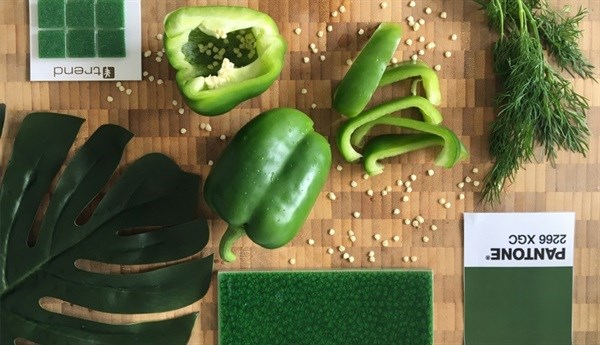
As we all know by now, Pantone's colour of the year for 2017 is Greenery, "a fresh and zesty yellow-green shade that evokes the first days of spring when nature's greens revive, restore and renew.”
We can’t think of a better way to refresh your retail brand at the start of 2017 than by adding some refreshing greenery into your shop interior. Here are some top tips for incorporating the colour green into your retail environment.
Use real plants
We have noticed a big trend for retailers and restaurants to incorporate real, living plants into their interior designs. The key here is to use living indoor plants rather than fake pot plants, which tend to look dirty and tacky quite quickly.
Real plants are not only a cost-effective way to dress up a retail space, they also purify the air and add freshness to your environment. If you are pressed for space, hanging plants, particularly water-wise succulent air plants are a great contemporary option.
If you have a bigger floor area, large plants with large leaves like a rubber plant or fiddle-leaf fig are low maintenance yet very dramatic and and work well with a contemporary, Scandinavian, minimalist aesthetic.
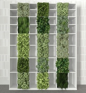
Vertical gardens are also very effective and can be achieved more easily than you may think by simply using an open shelving system stacked with pot plants as a room divider or feature wall. Once again, make sure you opt for water-wise, low-maintenance plants, such as succulents or kitchen herbs to save yourself time and money.
Stay natural
It is best to stick to natural shades of green in retail interiors; muted olive, sage and woody mint green tones are very on-trend at the moment. Stay away from bright luminous shades of green and turquoise tones which can feel out of date.
Understand colour psychology
Green is best used as an accent colour in retail design. Although green is relaxing and easy on the eye, too much green – especially dark green – can be a mistake.
Why? Green has been proven to relax and calm people. This is a good thing if you want to encourage shoppers to linger and browse around; however, in a retail environment, you would most likely prefer your customers to move through your store and to your till points quickly. Too much green can reduce energy in your shop and slow down the buying cycle.
So make sure you consider your objectives when you incorporate greenery into your retail interior this year.


