My mom had just gotten me my United Bankcard (I was 11 years old) and I was slightly put out that I had to get an Absa card soon after, which did not look as nice or have a special kids card. I doubt anyone liked the brand then and to be honest if you had to ask anyone now, not many folks love it either.
Throat-hold on the African nationalism narrative
Absa at the time latched onto the colour red and in keeping with the brand thinking of the time known as “la farge”, owned it similar to MTN’s use of yellow. The new colour palette is relevant today and has some interesting thinking behind it.
But the colour red has been burnt into the collective South African brand memory and has tremendous value and I foresee that the secondary colours that they have brought in will fade away into couch fabrics and social media backgrounds, for the simple reason that people notice brand colours first and the recognition and awareness of Absa ads will decline in the short term potentially growing in the medium to long term as they associate more with the new colour. It will be interesting to see how brave they get with their colour use as sales dip.
#Africanicity – so this is nice. With this new angle, they have taken a throat-hold on the African nationalism narrative in the South African banking space. Nedbank fumbled around with it in their advertising campaigns taking a leaf from the magnificent BBDO advert Made of Black for Guinness which in my biased opinion is still one of the best campaigns I have seen. Nedbank did not get it right and I heard collective groans at the cinema when their ad was aired.
Politics, a tough battle for banks
Banks (especially Absa) have a tough battle politically in South Africa. The EFF have unloaded their vitriol onto Absa in particular and banks in general, and I can’t help but think that this rebrand is in part a reaction to the prevailing WMC narrative and the legacy of the Absa business. I have not done any research panels on this article, but banks and banking don’t typically instil love, positive emotions and excitement. When developing a competitive analysis for a brand strategy we would look at strategic territories where a brand could move into.
Obviously, the team did their homework and saw that the emotional axis was barren and ripe for becoming a great place to position Absa. However, just because it is an open space does not mean you need to go there, there was probably a reason it was empty in the first place which I think Absa will find out sooner or later.
Let’s put the brakes on this topic though and go onto the logo.
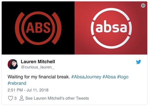
Sorry, when I googled the new logo this is what came up, don’t judge me.
Did anybody reverse image search this train wreck?
For a real analysis, I believe this article does a better job than me.
Digital touchpoints
Now there were justifications for the rebrand in terms of how important digital touchpoints are and why Absa needed to have a new corporate identity to become more relevant. What I can’t really understand in this day and age is how all the Absa branches have not been rebranded. This is a pic I took today at Canal Walk.
This is a newly revamped branch, looks great and must have cost a five-tune, but come on man, how complicated is it to change at least just the signage? The passed-out person on the couch is obviously thinking the same thing. Absa should have gotten an agency with mobile network expertise to manage the rollout. National brand? Have a new logo? Get your ass over the country and make sure that the day after the launch all the signage is changed.
Sadly, this is another half-baked attempt at relevance by Absa indicative of the bankruptcy of ideas at banks in South Africa grappling with their place in a changing world. As an agency insider, I know how often great ideas are diluted to an unrecognisable degree in large organisations, stripping away much of the joy and bravery brought to the table. So, spare a thought for the agency folks involved in this process, and the frustrated marketers at Absa.
Full disclosure: I worked on the JWT agency pitch over a decade ago, run a brand strategy agency and was not asked to the pitch (if there was one) and still have lingering hurt feelings of having my United Bank kids card unceremoniously removed. If I was responsible for this rebrand I would just sit back take a sip of my Johnny Blue, mute my Twitter account and wait until folks don’t care about the logo change anymore… which based on experience, will be real soon.
*Note that Bizcommunity staff and management do not necessarily share the views of its contributors - the opinions and statements expressed herein are solely those of the author.*


