Have you tried Google's Mobile-Friendly Test tool? It's a helpful, web-based tool for checking your website's performance on mobile devices. Before we get into the details, let's review a few points on the importance of having a responsive website.
A responsive website changes itself to fit the device you're viewing it on. This has a huge impact on the user experience as the content becomes easier to read.
A cleaner layout allows ads to be displayed more efficiently and this, in turn, has the potential to increase viewability and performance, meaning more valuable inventory and increased revenue for the publisher.
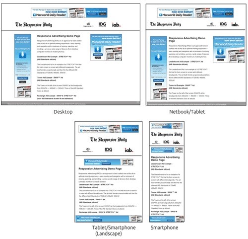
Typically, there are four standard screens sizes that publishers focus on:
- Desktop
- Netbook/Big tablet
- Tablet/Smartphone
- Smartphone
Here's an example of how a responsive website behaves based on the user's device:
Once your webmaster has worked his magic behind the scenes, you can run your site through the Mobile-Friendly Test tool - It will analyse whether the page has successfully passed Google's mobile-friendly test and within a few minutes, will report on what needs to be changed. It will also simulate the look and feel of the content on a mobile device, giving you the real experience.
Don't forget that Doubleclick for Publishers (DFP) is able to create responsive tags to serve different ad slots based on the user's screen resolution. To find out more, refer to this article and if you need any assistance with the setup, please send us an email to moc.anqd@srehsilbup.


