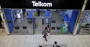
Telkom unveils refreshed brand identity with updated logo

The company’s refreshed look centres around what it has called the “Dynamic T” – a redesigned version of its longstanding ‘T’ logo.
According to Telkom, the updated branding reflects its commitment to remaining relevant and responsive to customer needs in a changing telecommunications environment.
“Our Telkom ‘T’ logo is iconic and a symbol of our connectivity, reliability, and innovation. As we signal the future, we will refresh our ‘T’ logo as a commitment to staying dynamic and relevant to the needs of our customers,” the company said in a statement published on its inTouch blog.
The new logo forms part of a broader visual overhaul, which includes a brighter colour palette and revised design system. The updated identity is being rolled out across consumer and business platforms.
Telkom said the rebrand is also being supported by a series of interactive pop-up events across South Africa, featuring public installations and digital engagement zones designed to introduce customers to the refreshed look and feel.
“This is more than a rebrand – it’s a movement,” the company stated. “Our new identity stands tall as a symbol of South Africa’s possibilities while staying true to our roots.”
This marks Telkom’s first major visual update since 2014, when the company moved away from its earlier “keypad” logo design.
The brand refresh comes as Telkom continues to reshape its position in a competitive telecoms market, where network infrastructure investment, digital transformation, and customer experience are seen as key growth drivers.