










VML Birdwatching at the Loeries | The Loeries a great stage for SAT
Danette Breitenbach


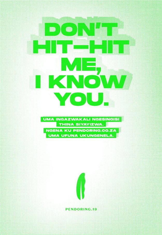
"Don’t hit-hit me." "Someone held me a bull." "Pinch the cat in the dark."
These somewhat confusing phrases make a little more sense when you realise they form part of this year’s Pendoring Awards campaign, with the tagline: “As dit nie in Engels werk nie, werk dit vir ons.”
This sentiment makes even more sense when you consider the awards were originally created in 1995 to promote and stimulate the use of Afrikaans in advertising, and since then have gone through a number of changes to celebrate all indigenous languages.

For example, the move to include and reward the best indigenous language advertising without any separation has been lauded as a ground-breaking, meaningful acknowledgement of local creative work that hasn’t been ‘copy-pasted’ from elsewhere.
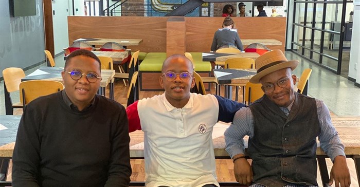
Here, Joe Public United chief creative officer Xolisa Dyeshana, as well as art director and copywriter team responsible for the campaign, Tshepo Mogorosi and Tshepo Tumahole, let us in on the essence of this year's Pendoring campaign…
It’s really important that we celebrate advertising in indigenous languages because South Africa is a unique country, with many indigenous languages, many of which are under threat of being used less and less often, as preference is given to English.
We know that to really, truly communicate with people, and to resonate with them, you have to be able to speak to them in their own language. Advertising can play a very big role, in terms of preserving our languages and celebrating them.
That is what makes the Pendoring Awards special in our industry.
We need to get clients on board, we need to get companies on board, we need to get media owners on board.
There is a tendency, often within our country, where the vernacular or the indigenous version of any ad is usually derived from the English. This is a great tragedy for our communications space.
There is a huge opportunity to connect with people more, if ads are conceptualised and executed with different language groups in mind, so we’re not just thinking of one type of consumer and then duplicating it for the rest of the languages.
When we got the brief, it was very exciting, for us it was a challenge to take the vernacular from just translating things to actually making sure that we come up with an idea in the vernacular, because usually when we do this type of work, we take the English and translate it.
It was fun for us to actually show that in vernacular languages, you have things like riddles and figures of speech that you can play around with and create work that will be memorable, work that will be targeted at the particular audience you want to talk to.
So we took it from that sentiment and that’s how we came up with the Pendoring 2019 campaign, where we used things people usually speak about, but only people who speak vernac would actually 'get'.
The fun part in it was actually creating the first ‘vernacular language’ campaign done in English.
They also went for a simple approach in making the consumer understand the visual language through illustrations to help the consumer ‘get’ the campaign easier, but it didn’t work as they were giving the idea quite easily to the consumer.
So they considered approaching it from a language point of view, where they wrote the lines in English, with the sub-headlines in the vernacular language the people speak, so that they would get the idea quite easily.
Dyeshana adds that they were meant to do a vernacular campaign. What the team came up with instead was something they felt was unique, as it ended up being an English campaign that can only be understood in the vernacular. He feels this is a unique space to be.
He also expanded on what the second Tshepo Mogorosi, the art director, explained that they went through quite a few iterations in terms of the look of the campaign.
There was the consideration of doing the line as well as an illustration that pertains to the saying, but they found that the sayings were powerful on their own. Hence the decision was made to rather make it a powerful copy-run campaign, using some of the most common phrases used in different vernaculars, showing how none of them makes sense in English though they make sense in the vernacular.
This exemplifies the tag line, “if it only works in the indigenous language, it works for us.”
We believe in growth. Growth of our people, the growth of our clients, the growth of our country. What we try and get our clients to see is that safe thinking is not what brings growth. Therefore stretching your mind and doing things in a unique way that resonates with your market is what is necessary..
We believe that more indigenous advertising is needed in South Africa. We find that when we do that kind of work, we resonate more with our customers, we find that our work has a more unique, local and resonant flavour; we find that it connects more, we find that it stands out more, in the sea of sameness that we see in the industry.
It’s important to encourage bravery and work with brave clients in order for their brands to truly connect with South African audiences
It’s always good to be able to have a birds-eye view of awards shows, and which agencies did how well.
Hopefully, something like this will encourage agencies to want to move up in those rankings, and to do more resonant and bespoke South African work.
Thumbs (and tongues) crossed! We’ll be providing live coverage of the awards and will publish the winner list and exclusive comments in full. Click here for the full list of finalists, visit the Pendoring press office and follow them on Twitter and Facebook for the latest updates. Click through to the Pendoring special section for more, and be sure to follow both the Pendorings and Joe Public United on Instagram for their latest updates.