A consortium led by Global Capital, in partnership with Benjamin Trisk, Mark Barnes and Simon Sussman, has acquired Exclusive Books and the brand's new identity, designed by Switch, will be on display for the first time on 21 August 2104, when the new branch opens at Rosebank Mall.
Larry Shiller, Executive Director of the agency, says that working with iconic brands, such as Exclusive Books, always generates excitement for everyone at Switch. "At the same time, we are cognisant of the responsibility that we have, not only to the brand owners but also to the brand's loyal followers that have an emotional investment in the brand through their own experiences, built over many years."
The new owners' vision for the bookselling empire, in line with global trends, is to create bookstores that are destinations in their own right. They're not simply places to buy books, but are rather spaces that people want to come to, to interact with authors, or to listen to talks on travel, gardening or cookery - and of course, to enjoy good coffee. The new identity needed to reflect all of this, while still being primarily and powerfully about books.
Inspiration
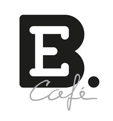
Considering all this, Switch developed a design that was inspired by the idea of the colophon, the printer's logo that appears on the spine of books. The 'E' is contained within the 'B', with the curves of the B suggesting the spines of a pile of books, with a grammatically correct full stop punctuating it. While the words 'Exclusive Books' appear alongside, the logo is instantly recognisable without them.
"The identity talks about the rich tradition of literature and publishing but it's expressed in modern, bold, simple lines," says Gaby de Abreu, Executive Creative Director at Switch. "But what makes it so exciting is its versatility."
He explains that the logo can retain its distinctive shape and core identity, while being adaptable in various colours and permutations to advertise in-store promotions, seasonal changes and topical events.
Instantly identifiable
"The 'E' within the logo can be created out of coffee beans for the coffee shop, or out of crayons for the children's section. However it is presented, the book shape of the B is strong enough to be instantly identifiable, as are the initials, allowing the other components of the identity to express different aspects of the store's business."
The team at Exclusive Books had high expectations and was delighted with the results. "We wanted a new identity for this iconic brand that everyone could identify with," says CEO Trisk. "The colophon identity delivers that accessibility and familiarity, while still allowing us to use different colours and devices to create excitement about events that we'll be holding or specials that we'll be running."
The new identity will continue to reflect and support any new developments in the store's future, thanks to its simplicity and versatility. "What we like about the identity is that it has a strong visual association with the idea of a book, but it's modern, and flexible enough to express everything that Exclusive Books wants to do in future as it develops its brand," says De Abreu. "We're looking forward to going on the creative journey with the company, as it evolves and develops this exciting brand."


