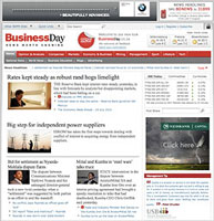
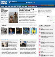
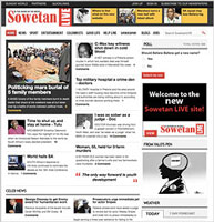
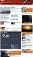
The not-so-new news sites
The real influence
What REALLY influences the redesign is new technology and functional techniques that have a tendency to be escalating at an alarming rate. The problem is, the visual design has not.
"Why?" you ask. Well, the content, which is why the user visits the site in the first place, is uploaded via many sources - writers, bloggers, journalists, syndicated feeds etc into a sophisticated content management system (CMS) where it's assigned to categories, subbed, proofed, image and social linking, search engine optimised (SEO) and tagging, edited, approved and then published to the website literally immediately, 24/7.
And that's not the only consideration for a designer - it's leaving space for the advertising!
Unfortunately, most news sites sustain themselves through advertising, which I hate to say, is a nightmare for a designer. No matter how beautiful your design looks, that ad from some "lose weight fast" brand's colours will just clash!
The variables of content
The design (namely the usability and information architecture) of a site of this nature has to consider the variables of content in order to display it in a manner that's easy for a user to read online. What usually results is a series of "design" templates (layouts) and style sheets to accommodate these variables.
As is evident, it's quite a complicated process and the main reason that many sites' visual design is so similar. The other reason is that designers are pretty much dictated to by limited resources, technical delivery and human behaviour (what users are supposedly used to). No easy feat!
Over the years, the main visual design change has been a move from a left-hand side navigation to a top navigation... and not much else, I am afraid... oh sorry, the logo/colour changes as its corporate identity does.
A new beginning?
So when I saw an article in February 2010 announcing that Research Studios, headed up by Neville Brody (the guy who changed the face of magazine design and typefaces - design guru of note), was now responsible for BBC Online's Global Visual Language, I waited in eager anticipation... Would we be seeing a new beginning in site design?
The relaunch was accompanied by this blog post on 14 July and two days later the redesign had mixed responses and been slammed .
Now I know you can't keep everyone happy. People by nature detest change. In addition, the criteria involved in designing a site like this is onerous, to say the least. But notifying people of a "major relaunch" fuels expectations that you might not, or cannot, fulfil. Let's be honest - every time Facebook changes its interface (mostly minor) and lets people know beforehand, the resultant furore is explosive.
Will not revert
BBC responded on 22 July saying it will not revert back to the old design.
Exposing yourself to potential criticism allows for a multitude of (if not very well-informed) opinions and a subsequent need for public justification. However, (and apologies to the design team), I agree wholeheartedly, but not on what most people are objecting to - it could be any news site... it's simple, just change the logo!
Here's in hope to one day seeing a real change in news site visual design... and don't keep me waiting... I'm impatient!


