#DesignIndaba2017: Dances with data
Visual data
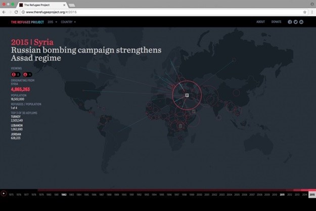
According to Brooklyn-based information designer Ekene Ijeoma we are “swimming in a sea of data”. This is not a bad thing. For example take a look at Ijeoma’s awesome 'refugee project', a website which extracts these oceans of encoded intelligence about human refugee migration onto a map, enabling the viewer to grasp the scope of this topical global issue via real-time stats and graphics without any political agenda.
Also from Ijeoma, 'wage islands' project – an ingenious interactive installation, (gotta love alliteration), which sees a 500-piece laser-cut acrylic model raised or lowered out of a water tank to convey the issues of wage and housing inequalities in NYC, demonstrating at the touch of button where one can afford to live in New York based on income. As in the previous example providing a tangible picture of an abstract concept.
Ijeoma takeouts: “Think like citizens not just creatives", "Use data for people not just consumers”, and the quotable clincher “Let's make conversation-pieces not just masterpieces".
Seeing through data eyes
Giorgia Lupi is possibly the uncrowned queen of the infographic. The 'data-artist' has a string of awards, articles, mentions and exhibits, based on her ability to elegantly visualise the details of everyday life through data-driven eyes, citing data as “a pair of new eyes to see more and better”.
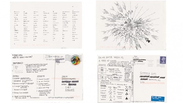
Her book entitled Dear Data, co-authored with friend Stefanie Posavec contains 'data postcards' from the project, which saw the pair mail postcard-size, data-inspired illustrations to each other every week for a year.
You can give it a try. All you need is paper, some coloured pens and a commitment to visually map/plot/graph any mundane aspect of your daily life, for example how many times you check the time in a week, the number of thank yous given and received, or the number of times you smiled at strangers. This is really the essence of spatial mathematical thinking and might be considered in primary schools to advantage.
Florally aural
The key component of Lupi’s presentation was a collaboration with accomplished guitarist and composer Keki King, using hand-drawn data – where lines are beats, flowers are notes, dots are finger patterns, top and bottom are left- and and right-hand and so on, providing a lyrical floral representation of the music, that visually expresses aural concepts that enhances the atmosphere and essence of the music.
Aural data... digital
If visualising data is the designer’s domain, gathering it is at the cutting edge of artificial intelligence, an area where Finnish techpreneur and therapeutic designer Marko Ahtisaari is in his element. A Director’s Fellow of MIT Media Lab, he is CEO and co-founder of the Sync Project, a worldwide experiment using music as an alternative to pharmaceuticals in sleep, relaxation and other therapies. The project aims to build a data-gathering platform via that ubiquitous sensorial device, the smartphone.
As one of the nicknames for Cape Town is Slaapstad (rhymes with Kaapstad, Afrikaans for Cape Town, and means 'sleep city'), Design Indaba seemed an appropriate target audience for the invitation to participate in the project via an app, featuring the music of Marconi Union’s Adrift, apparently the most relaxing music ever produced. Download it and sleep your way through this global research project.
Biometric data
Accessible data may be mined in a number of ways from the range of human motion and rhythms to intelligent wearables from designers, such as global graduate and lecturer at Parson School of Design New York, Grace Jun, who embeds clothing with data to capture the range of movements of people with disabilities, the elderly or those who may have undergone surgery to create new dialogues with therapists.
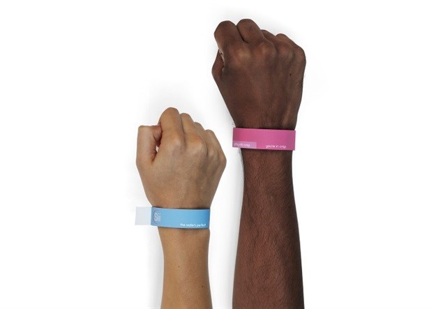
Gathering biodata is also seen in the work of local award-winning Red & Yellow School graduate Carina Bonse, who has developed a wearable based on her research monitoring the Ecoli levels due to sewage on Cape Town beaches, via a smart armband.
The data frontiers
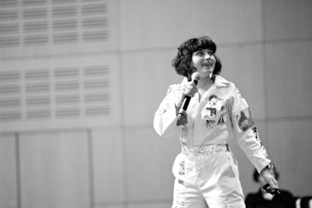
In her dramatised presentation, Nelly Ben Hayoun touched on topics pertaining to the outer reaches of both physical and theoretical knowledge, using the metaphorical courage of explorers such as Vikings setting out into the unknown, to illustrate contemporary quests, such as explorers diving down into the ocean depths where apparently microbial maps of information from 3bn years ago are preserved in fossil records, the mapping of microbial diversity and terraforming as a means of colonising Mars, work being done at the SETI Institute with the mission to search for extraterrestrial intelligence and such like pursuits.
Comment from the SETI Institute’s former director, Jill Tarter advises that with regard to ascertaining whether humans are alone in the universe, the best way might be to “look at radio signals” and other frequencies – a field apparently known as Astrobiology.
Data soup
Ijeoma had already said that we are “swimming in a sea of data”. In her presentation on the last day of Indaba, Tea Uglow, creative director of Google’s Creative Lab in Sydney, musing on the incubating principles of virtual-, multi-dimensional- and augmented-reality, commented that “we have not even begun to scratch the surface of what we know”. With regard to the sea of information in which we reside and how we may engage with in the future – gesturally, visually, aurally, sensorially, physically – Uglow’s prediction that “the whole of reality doesn't need to be on a screen”, may yet prove the way we currently interact with the informational data around us as clumsy a papyrus scroll.
Images courtesy of DesignIndaba.com.
For more, visit our Design Indaba special section for all the latest coverage!


