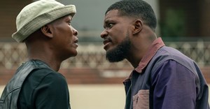
#Loeries2018: "Bringing it back to the bird," with Nathan Reddy of Grid Worldwide

No stranger to The Loeries, Grid Worldwide chief creative officer and founder was the 2017 Loeries Creative Hall of Fame inductee, at the age of just 47. With Grid the only SA agency to win a Grand Prix on the first award night of 2017, in the communication design category for Marble's "Meat made luxury."
At the time, he shared with me in an exclusive interview his views on the formidable work coming from the Middle East at the moment, and why his 23-year-old daughter is his source of inspiration when creative block strikes.
Now, he shares his personal and agency relationship with the Loeries over the years and lets us in on the thinking behind the Loeries’ rebrand.
 Let us in on that Loeries-Grid Worldwide relationship.
Reddy says, “We’ve had a lengthy relationship with the Loeries on the design side and on the brand side and on the communications side. Over the last eight or nine years in particular, we’ve had quite a close collaboration as the years went on, in terms of refreshing, upgrading, keeping up with the times and always being relevant in terms of what the audience is doing and speaking about.” It’s been an interesting journey – by no means a fly-by-night journey, as Grid has thoroughly understood the challenges faced by and amazing opportunities of the Loeries.
Another iconic brand refresh from Grid. pic.twitter.com/wJojc2TtL9 “But we strongly still believe in the creative product. The idea of awarding creativity is an amazing tool to have, as that’s all that separates one brand from the other – the ability to stand out,” Reddy affirms. And they certainly do, with The Loeries as a platform. When asked how the 2018 refresh differed from the last big rebrand when Human joined the Loeries in 2005, Human thought back to that time and said it was a big changing year, as that’s when the Creative Circle spearheaded all the change with the Loeries. Up to 2004, the Loeries was run by the Marketing Federation, so with Human joining in 2005, it was a complete refresh and they wanted to signify that things were going to be different. They wanted to show some freshness, in going from where it was in 2004-2005. One of those things was a brand redesign, by King James RSVP in 2005.Describe the creative process that went into refreshing the Loeries logo.
“Especially when doing a rebrand, a crucial part of the creative process is that the company needs help and clarity,” says Reddy, so it’s not just about doing work for the sake of redoing stuff. It has to resonate with how things are. “The world is moving towards simplicity, or reduce to amplify. There’s a lot of clutter, there’s a lot of noise around certain things. We at Grid firmly believe the idea of taking away the clutter. So it’s ‘reduce to amplify’ in the sense of making the message clearer, getting a clear understanding of where things lie in a global context and how award shows are seen around the world.”Andrew Human on the Loeries’ logo and branding refresh with Grid Worldwide
Human says this was a significant step and the process resulted in a beautiful logo, with the bird hiding in the bush, the concept behind that being that it’s rare and would be difficult to get your hands on one.
Human adds that a redesign’s not something you do lightly, it’s not an annual campaign. So for any brand where you say “We’re going to change the logo,” it really is a big thing. “If you look at 2005, we didn’t know it was a new era. We’d taken over the brand and restarted it, so it was a much more humble logo in that sense – subtle,” reflects Human.
Now, more than 10 years later, on the Loeries’ 40th anniversary, we worked with Grid and looked at creating something much more proud and bold and overt, where the bird is in flight and also very strong, as the Loerie has come out of the bush and is free.Human says, “I think it’s right for 40 years, it’s right for the time, now with its bolder, more confident positioning.”
Reddy agrees, adding that the cosmetics of things are just a hygiene factor. So you need to take away the clutter and bring the meaning back. “The idea of the bird sitting in the bush vs the bird in flight is resonant of the fact that we’re not hiding. There’s an understanding of the fact that when you win a Loerie, you do fly as an individual. So there’s a case for semantics, and it’s design language, I don’t want to make it a big thing."
To me, the idea of rewarding creativity is the sentiment of the campaign, of the refresh, so rewarding creativity, to me has a duality and an amazing understanding of how when creativity works to solve a problem, that in itself is rewarding. But also the fact that it’s a physical award, a physical award show.
Why is it important for a brand to refresh itself in this way, especially as the Loeries have been going for 40 years, and is definitely already well-known. What is the benefit of the refresh, to the brand and the audience alike? “Well, we’re not rebranding the word ‘Loeries’, so audibly it is still ‘Loeries’. But if you look at the world of brands, a lot of the times what happens at the Loeries is you have the campaigns take away from the lacquer of exactly what the brand is about,” says Reddy
He shared the following example: “If you look at the Oscars, they’re purely about the Oscars, the actual statues and what goes into winning them. There is such clarity around that. But that clarity gets clouded with The Loeries by campaigns and creatives being quite fancy about ideas. They forget about the nakedness or clarity of winning that bird.”
What are you most looking forward to creatively from 2018, the Loeries’ 40th year?
Reddy says he’s been attending The Loeries for about 25 of those 40 years and says: “Every year I go and I want to try harder. That’s never going to change. It’s like every time I go I get inspired, and every time that inspiration leads to doing, and I get to celebrate my fellow industry and I see the calibre of SA’s work.”
Reddy adds:
Each year, even though South Africa only has about 50 million people, and our adspend or marketing spend is fractional to that of the rest of the world. We punch way above our weight and consistently come tenth in the whole world in terms of country rankings at the likes of Cannes Lions or One Show or D&AD. The Loeries has allowed that South African competitiveness, to make sure we make it to the world stage.With that sentiment in mind, The Loeries’ brand refresh couldn’t have come at a better time. Follow Reddy and Grid on Twitter. You can also click through to our Loeries’ special section for more, and be sure to follow their social media feeds for the latest updates: Twitter | Facebook | Instagram.