#CEMAfrica2017: Empowered customer experiences lie in multi-focused design

One may say that Schoof is in a respectable position to speak on the topic, following Spree's Digital Innovator Award win at last week’s CXA ceremony. The company won for its launch of the first image search shopping feature in Africa, which identifies clothing or footwear seen in photos and images and finds users something similar in the app.
Ever-changing customers
Schoof opened his presentation with the question, “who is your customer” – simple to ask but difficult to answer. Across industries, businesses tend to oversimplify highly nuanced customer groups. He said that brands have a tough CX journey ahead of them because even with the proliferation of data and the rich insights gained from it, customers are essentially moving targets.
“Even if you understand your customer segments right now, that’s not good enough because it’s constantly changing. Markets are changing, customers are changing, and technology is changing,” he said.
Prioritise mobile or go home
Operating on a mobile heavy continent, African companies should be focusing their design and strategy on mobile first. Despite the fact that the ‘mobile-first’ approach started gaining traction nearly a decade ago, Schoof says many businesses are still not getting it right.
“If you’re wondering whether you should be directing lots of time and energy towards mobile, the answer is an obvious ‘yes’. It’s becoming ubiquitous, and in mobile-heavy markets like Africa and India if you don’t get that experience right you might as well go home.”
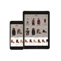
When Spree was established, its design strategy focused on desktop first because at the time that’s where traffic and sales were. This strategy has since evolved to not only focus on mobile first, but on mobile app first - an approach that seems to be working considering that close to 50% of Spree's sales come from its app.
“What we do now is this: if our mobile app design works, we then take it to the tablet app, followed by the mobile web and the last iteration is the desktop. We’ve completely changed our paradigm as to how we approach this customer experience.”
Multi-device design is personal
A mobile-first approach is, however, not the be all and end all. Schoof noted that effective personalisation is only really possible if you’re doing multi-device design.
“Your device is different to my device, and trying to push the same thing through both of them is not going to work. These devices offer our customers so much. Brands can leverage this to create amazing experiences, and we need to leverage it to really personalise the experience.”
Businesses are now designing for wearables right up to large-format TVs, and everything from input type, to aspect ratio, to the posture of the consumer when they’re engaging with the interface has to be carefully considered. This changes how you need to design in order to make sure your website or app works well across the board and is a highly relevant experience for the customer.
Web versus app
Further to multi-device design, there’s multi-platform design. While the topic of web versus app is often debated, Schoof believes in doing both.
“Apps offer great engagement but you’ll get reach from mobile web because there are less hurdles between the product and the consumer. If you want to maintain a certain reach, that you may or may not convert to app, then you need to have a really good mobile web experience too. In my opinion, it’s not about one versus the other, it’s about how to offer both and make it complementary. At the end of the day, it’s about giving your customer the choice.”
"What we're trying to do, and what a number of other businesses are doing, is provide customers with a variety of options to use when interacting with the brand. That's the key to success."


