


Top stories


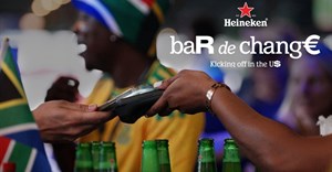
LifestyleHeineken helped South African fans beat World Cup beer prices with the return of Bar De Change
MSL Group 13 Jul 2026
More news


Marketing & Media
Nominations now open for the 2026 Kfm 94.5 Best of the Cape Awards – Powered by Yoco
Primedia Broadcasting 13 Jul 2026


Lifestyle
We've been measuring football success wrong
SAB Corporate Fifa World Cup Campaign 13 Jul 2026

ESG & Sustainability
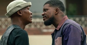
Racism at the World Cup is an ugly reality. How to understand where it comes from
Christian Ungruhe 1 day


