



Trending


Advertise your job vacancies
Subscribe & Follow
Jobs
- Lecturer Cape Town
- Lecturer Cape Town
- Sports Partnership Account Manager Johannesburg
- Media Data Analyst Johannesburg
- Multimedia Designers Cape Town
- Aftersales & Sales Administrative Assistant Cape Town
- FMCG Junior Key Account Manager Cape Town
- Receptionist Cape Town
- Multimedia and Content Designer Johannesburg
- Senior Sales Manager Johannesburg
Zara ridiculed for 'lousy' logo redesign
Design Taxi reports that designers are mocking Zara's new logo design. The company changed its spaced-out wordmark logo to one that is overlapping characters and serifs.
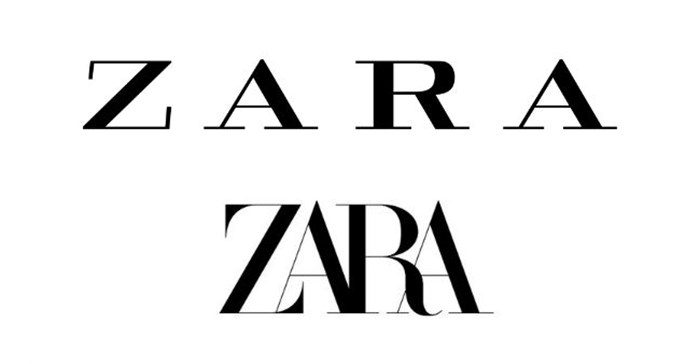
Source: Design Taxi
Lifestyle and design enthusiast Jumabc. commented on the new logo saying, "Needs to fit in size zero," and Co-op designer and UI engineer Matthew Morek commented saying "Lousiest redesign I've seen this year, and it's just January."
The logo, which was as released alongside Zara's Spring/Summer 2019 campaign, may however only be temporary.
Read more on this here.
