














Q&A with SKIN Functional’s Shannon Dougall
Maroefah Smith


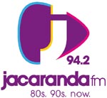
Kim Miller, executive creative director of Timesquare, the agency that conceptualized the logo and brand identity says, "With music being so central to the station, we wanted to accentuate this with the icon design. So, we created a simple but bold icon by cutting a "j" out of a guitar plectrum, an image synonymous with music and rotated it in order to suggest a play button.
"The colours of the icon were inspired by the two main cities within Jacaranda's broadcast area - purple for Pretoria and yellow for Joburg, the city of gold. The two accent colours, pink and blue, represent one of the station's core attributes, its guy/girl next door appeal."
"The new look and bold statement are just parts of our strategic repositioning," says Jacaranda FM GM, Kevin Fine. "The heart of the station remains in exactly the same place, but we wanted to clearly demonstrate the freshness and energy that's being put in to the product. Our listeners will hear it and feel it with several new initiatives, but we will always be a great SA brand with a strong heritage and connection to our staff, listeners and clients."


