At the recent Design Dialogue at Decorex in Johannesburg, Leatrice Eiseman, executive director of the Pantone Color Institute, spoke about home and interior colour trends for 2013.
Black and white will never go out of fashion and, according to Eiseman, no matter what colour people plan to use, they can be confident that it won't go out of fashion quite as quickly as in the past.
That's because sustainability and the recession have encouraged less interest in the throwaway and the faddish. We want to keep things for longer and reinvent what we already have, to keep it looking fresh.
"In order to create the 'magic' in the marketplace that ultimately leads to sales, colours for 2013 will need to coax and cajole, soothe or astonish, renew and replenish," she notes in the accompanying guide. "At the same time, there will be the consumer's expectation of practicality - what colours have staying power and can be relied upon as a steadying influence in unsteady times."
Nine Pantone trends
- Connoisseur - As the name implies, this is all about history and elegance while taking a fresh approach to the finer things in life. Colours are a combination of monochromatic violets and orchids, deep mahogany, champagne beige, silver, patrician purple, pink nectar and white alyssum.
- Glamour - This trend will be strongly influenced by the forthcoming The Great Gatsby and other movies set in the age of Art Deco. (Eiseman's husband sits on the board of the Academy Awards, so she gets to see all the movies that may be influential.) Think Rio red and Monaco blue, moon mist and jasper teal (teal will be big) as well as silver and champagne beige.
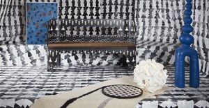
- New Old School - Preppy with a twist, this is another palette linked to heritage and history. She expects the colours of the British flag, which would have been so prominent during the Olympics as well as the Diamond Jubilee, to exert a strong influence. Here we see ribbon red, bright white and sodalite blue with green, ultramarine green and the greys - gargoyle and microchip - to create raw contrast between the old and the new.
- Rugged Individuals - The whole of the West Rand will be ecstatic at the revelation that cowboys and cowgirls are big. "These are the rugged individuals who encourage and inspire the natural shadings of the prairie and polished leather, weathered wood and animal hide while the earthiness of raw sienna tones blends with the inevitable classics of both vintage indigo and stonewash blue jeans."
- Extracts - Colour of the year for 2012 was tangerine tango and orange and spice tones dominate this palette, which focuses on combinations that are "zestful, pleasing and often unexpected". Spiced coral, brandied melon and apple cinnamon are balanced with dusky pink, baked clay and green banana.
- Footprints - Africa has influenced her more than any other continent and its influence comes through in this palette, which includes colours that are "bold, forthright and very directional". Tangerine tango is here along with peacock blue, pink flambé, oasis (yellow-green) and Sudan brown.
- Sojourn - Less intensity here, although there's plenty of purple to contrast with green. Syrah, foxglove and Baton Rouge fuchsia (back to the fuchsia, Eiseman says apologetically) contrast with pampas and green moss along with the organic hues of cobblestone and shitake.
- Surface Treatments - This palette is a highly textural one that alludes to the colours of water and sky - Maui blue, vapour blue and tornado - with colours of the earth such as fallen rock, birch and agave green. She is strongly influenced by nature in her search for inspiration. "Green is nature's neutral," as she reminded us; in her view, we should use it more in our interiors.
- Out of the Ordinary - "Whackadoodle" is a word that Eiseman loves - she was using it to describe Lady Gaga - and this is the palette that alludes to more eccentric combinations. "Quirky, odd, whimsical or even a bit obtuse, Out of the ordinary products or displays immediately capture the imagination of the beholder." The list of colours lends itself to arresting combinations: bonnie blue, pureed pumpkin, chocolate truffle, amber green linden green, golden rod, bright violet and rosebud.
Also the founder of the Eiseman Center for Color Information and Training, she has also authored eight books on colour and is responsible for the top ten seasonal colours in Women's Wear Daily, said to be the bible of the fashion industry.
For more, go to www.colorexpert.com or www.eisemancolorblog.com.