In 2011 we met with a Cape Town based window and door company, owned by a father and son team. As often happens with older companies, their logo had been decayed by time and was not reflecting the quality image of their workmanship and professionalism. The company did not have a payoff line, an out-of-date website and a fleet of battered vans. They cleverly recognised that they needed a brand renovation - who wouldn't after 55 years?
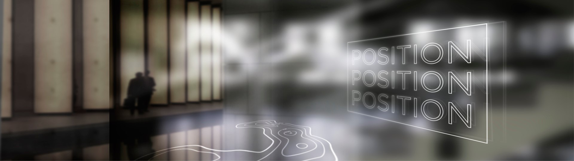
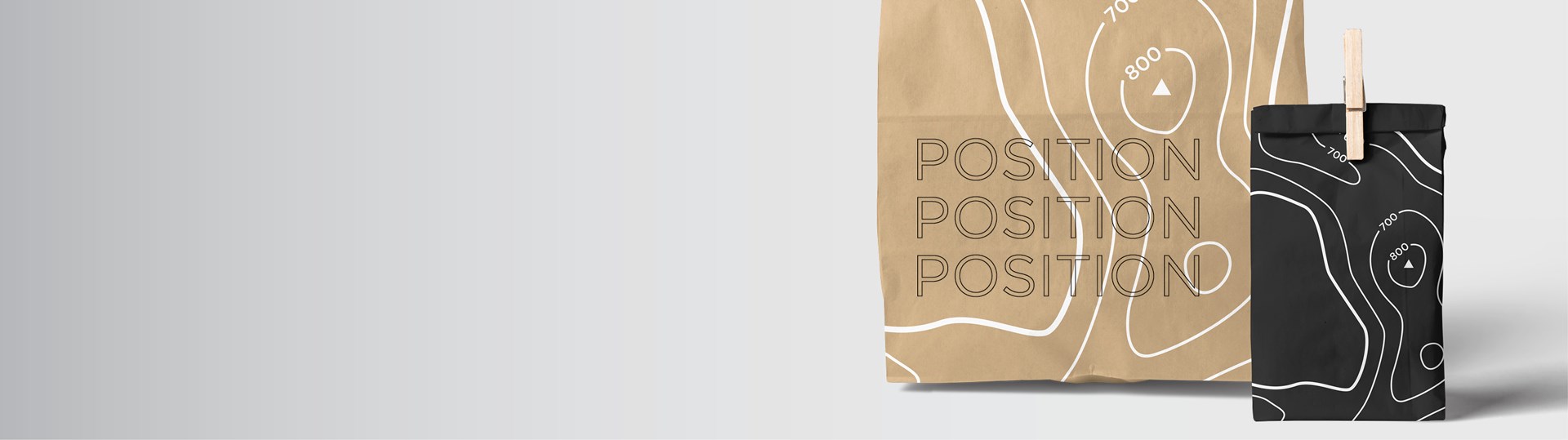
You are designing a feeling not a logo
To resist an image of a window frame as a logo for a window company is not easy. It is the first sketch you do. However, after immersing ourselves in the problem, we realised that the client does not sell windows - they sell light and views - and knew the corporate identity needed to express the feeling of the breath of fresh air you would experience when you upgraded a rusty, old window or transformed a wall into a view or swung open your new sliding door onto a deck.
Brand excavation
We began to excavate the Metal Windows heritage, finding the undiscovered gift of the two capital letters M & W, that reflected each other - reflections seemed a perfect visual metaphor for a window company and so we chipped away at an identity and a payoff line - My personal favourite at one point was "First for windows and doors that last" - which client was not comfortable with. Eventually we agreed on the line that at once expressed the feeling we wanted as well as the years of experience the client wanted to convey - Opening windows for 55 years, retaining the colour red for the logo and adding a seagull, an icon synonymous with Cape Town's fresh sea air.
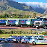
The next step was the unavoidable issue of the fleet, which was well known about town for its iconic hand-painted bottle-green checked VW kombis, but which did not look anything like our shiny, airy corporate ID and which were not likely to be traded-in, in the foreseeable future.
The solution to this was engineered by client - aluminium boards that clipped onto the vans, allowed us to show blue sky and the trademark seagull, giving the old vans a new lease on life. We also renovated the entire sales fleet and the owners' personal vehicles - using the cars as moving billboards.
Branding is like pruning
Branding or re-branding is a bit like pruning, you clip and clear and try to find the shape that company should be that has got lost in the undergrowth.
The last piece of the redesign was the website. Client handed us a carrier bag full of photo albums and CDs and asked if we would look to see if there was anything we could use from there on the website. We couldn't - for the simple reason that most of the photos had been taken in the Cape winter, which is the time when people usually decide to fix leaking, rusty or drafty windows. Also the pics had been taken for client's own reference, so there were ladders, toolboxes buckets etc still in the photos. Like trying to sell an unwashed car - not the most desirable route to market.
Branding inventory
Client drove us around town to see all the buildings, homes and apartment blocks they had worked on over the years. It was only then, that we realized the true extent of the company's scale and heritage. Even though we had worked on the brand for 6 months, we had no idea that our clients had been responsible for replacing and repairing windows in many of Cape Town's most iconic and landmark buildings - The Old Post Office, the Colloseum, the Adderley, Mutual Place, the Cape Sun, The historic Vineyard Hotel, almost every apartment block on the Sea Point beachfront - the list went on and on.
Information architecture
A website is information architecture. Most websites start with About us and never get much further - which is ridiculous, because people come there because of "About me" - their problems, their needs. A website should therefore anticipate the experience of any kind of potential customer that might come to their site. Our approach was that a picture tells a thousand words and can communicate that you "mean business" at a glance. A website can be as engaging as a coffee table book - especially in a city as beautiful as Cape Town, showcasing a company whose craftsmanship and service levels speak for themselves. www.metalwindows.co.za
Niptuck
At the end of 12 months all the nips and tucks of the renovation were complete. Client has testified to a surge of interest and enquiries. A strong, proud new brand identity imbues staff and teams with a renewed energy and focus, a feeling their work is worthwhile or meaningful, in this way a good brand identity reflects the true value of the company and its ethos while also honouring the people who have helped to build it.
It is this sort of pride that good branding and well thought out design can achieve, the economic renewal of companies, even of whole regions - with love from Off the Shelf Marketing.