


“In a world where things have become more intricate and complex, we have chosen to go for a simpler, bolder emblem that resembles our purpose to deliver on more than just medicine in a newer, nimbler way,” said Wilmi Hudsonberg, marketing and business development executive at Pharma Dynamics
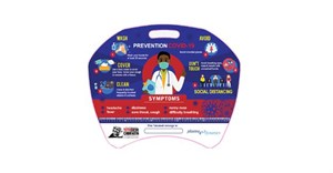
“The recognisable, yet reimagined nexus at the centre of the logo both acknowledges our history and honours the original visual mark. It represents our focus on healthcare through patient and customer-centric solutions. Staying close to the care journey and moving beyond the pill, through preventative care remains an important part of our value offering,” she continued.
Hudsonberg said the choice of blue hues is meant to visually express Pharma Dynamics' commitment to science and patients as well as the trust between them and their customers.
Dark blue represents the clinical efficacy and dedication to high-quality standards and light blue is symbolic of simplifying the care journey through digital innovation - supporting patients’ post-script by linking the physical product to disease education and lifestyle adjustment programs through the use of on-pack technology.
“The use of a cleaner and modern font not only denotes our company tone and manner in letter form, but also signals the company’s ongoing expansion,” Hudsonberg added. “To transform the future, we need to think and act differently today. Our goal is to do so justly, sustainably and responsibly.”
“Our new branding encompasses our vision for the future while acknowledging our past that has moulded us into the company we are today. As we celebrate 20 years in business, we are excited about the opportunities that lie ahead," Hudsonberg concluded.