"Our research revealed that the brand was well-established and entrenched, which is essential in an industry where trust and integrity are key," says Vuyo Lee, executive: brand, customer and transformation of Mutual & Federal. "However, we also learnt that our brand seemed to lack relevance for the younger market and it was seen as being rather old-fashioned and out-of-date."
Referring to the rebranding launch held 19 August 2011 in Sandton, Paul Jackson, MD at Volcano, said, "The brief from the client was very clear. As a company in the financial sector, they wanted a brand that would communicate their heritage and stature in the industry but would also have a more contemporary look and feel, without being too overly designed or funky."

The element of its identity which was the most recognisable to the public was the distinctive green of the logo, a direct link to the company's mother brand, Old Mutual. "Being part of the Old Mutual group is an important aspect of our identity and, given that we are now 100% owned by Old Mutual, we felt that our refreshed brand needed to reflect this and be closely aligned to the group brand identity," maintains Lee. "However, we also wanted to retain a distinctive identity, which emphasised our unique brand positioning."
The focus of this brand positioning was the importance of relationships, specifically with its brokers. "As a broker-centric company, with 95% of its business coming from this channel, we felt that the client should highlight this aspect and the importance of advice," notes Jackson. This relationship focus is clearly emphasised in the visual device of the ampersand, which is brought to the fore in the new-look logo. "We wanted to leverage the ampersand to become recognisable and ownable for the brand, while communicating a degree of sophistication."
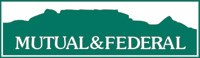
Another significant change in the logo is the removal of the Table Mountain icon in the background. "The mountain symbolised our company's place of origin, 180 years ago in Cape Town," explains Lee. "However, our research showed us that the mountain was the most misunderstood element of our brand identity. Some of the respondents were not even aware that the etching depicted Table Mountain or that we had operations in other areas outside Cape Town. Thus it was obvious that the mountain was not a strong brand anchor for Mutual & Federal." In addition, with the company's expansion into other regions of southern Africa, it made sense to develop a brand that was more generic and universal.
One of the key messages being communicated in the various executions of the refreshed brand, from TV to radio to outdoor and print, is the emphasis on insurance being vital to protecting what is important to the individual. "Insurance is often seen as a grudge purchase. So we wanted to change that perception by reminding people that insurance is all about preserving not just their assets, but the sentiments they attach to these possessions," notes Jackson. "'Protecting what's important to you', our new payoff line, is about protecting your hopes and dreams which are part of those assets."