![]()
It was a sneaky curve ball to change their logo and one that has many users asking, why? Well according to Ian Spalter, head of design on Instagram "If the lens is a bridge into the bolder, simpler glyph, the rainbow is a bridge into the colourful gradient. Colour has always been a huge part of Instagram — you see it in the classic app icon, filters, and the community’s photos and videos," he says in a post on Medium.
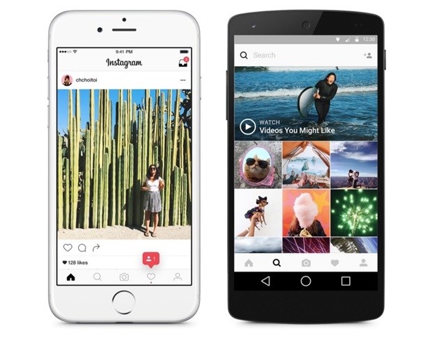
The change has also stretched to Instagram's other apps - Layout, Boomerang and Hyperlapse. There's also more features in the Explore tool to discover new photographers, and the user interface has upgraded as well to be simpler and sleeker (admittedly this is a nice touch although quite plain).
"As we reduced colour and noise in the UI, we saw interaction patterns that no longer felt native on iOS and Android devices. By paring down the new interactions and using standard iOS and Android components, fonts, and patterns, people will be navigating familiar terrain," Spalter said.
The new logo will take some getting used to and it seems like an odd decision seeing as the previous logo was so universally known. Yes, it's nice to modernise a logo, but to change it completely is a bold move, that's like Facebook becoming red instead of blue all of a sudden. The will to modernise logos is becoming a big trend as of late, as brands are continually trying to appeal to the next generation and stay relevant and hip. But brands need to take care to not go overboard on these rebrands. Users become familiar with a certain style and change isn't always a good thing.
Instagram have been making a plethora of changes lately, from the updated newsfeed, longer videos and new business profiles. With them being owned by Facebook you have to wonder if they're behind all these new developments.
Spalter concludes in saying "Our hope is that people will see this app icon as a new creative spark — something to have fun with and make their own."
What do Instagrammers think? Is this a good move from Instagram to change their logo and UI?